

WordPress Consultant Tips: Helping You Design Pages That Engage Customers
Standards for website design are constantly evolving, along with the expectations of your website visitors and customers. Today’s web users expect businesses to have well-designed and easy-to-use websites. If the site is poorly designed, difficult to navigate or simply uninteresting, then visitors will be quick to exit (and may never come back).
This is where the expertise of a WordPress consultant can pay off big-time.
When a business has a website that functions well, isn’t too distracting and looks professional, it develops credibility and trust with its customers. That trust translates into high engagement, conversions and sales.
For the success of your business, you need to place a greater emphasis on the design of your website. The following 9 WordPress Consultant tips will help you do just that.
WordPress Consultant Design Tips
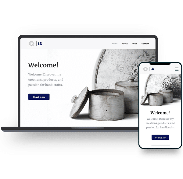
1) Utilize Images to Break Up Text
Imagine going to a website that had numerous paragraphs of 6 sentences or more. 99% of visitors aren’t going to take the time to read those long blocks – it’s daunting just to look at.
Professional websites use images and graphics to deliver messages. While the text is important on your web pages, you cannot overdo it. Rather, place images under headings with a sentence or two for further clarification.
Consider placing some sort of visual element—graph, diagram, picture or other—every 3-4 paragraphs. This will effectively break up your content while still having enough information to answer all your users’ questions.
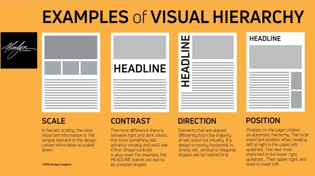
2) Use Visual Hierarchy
Just like everything else in the world, websites follow a hierarchy. Professional web designers know this all too well. This hierarchy dictates where images, headings, paragraphs and subtext all go.
If you want something to stand out to your users, increase the size of the text, place it at the top of your page and don’t let too many other elements distract from it. On the other hand, less important information can go to the bottom of the page.
As you’ll see below, this hierarchy utilizes other design tips, such as the importance of color and spacing.
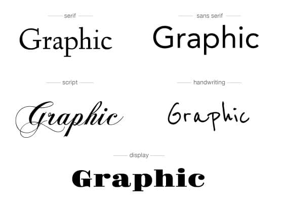
3) Choose Your Fonts Wisely
Many first-time web designers may pick out a few different fonts that seem fun and exciting. However, that’s not how you should pick fonts. Any WordPress consultant will tell you that you rarely need more than 2 fonts: one for the headings and one for the body and smaller text (or minor variations of those font families).
Generally speaking, headings tend to utilize serif fonts, as they look better in larger and more bolded styles. Smaller text for the body and captions looks better as sans-serif font, as these font styles are typically easier to read.
But the important thing is that your font must match the design and purpose of the rest of your website. If you have a personal blog, maybe a more decorative font suits you (though 99% of the time, these are very hard to read). If you run a business, you should opt for an easy-to-read, professional-looking font.
4) Use White Space to Your Advantage
When you design your website, think about contrast. You want images, text and calls-to-action to stand out. While you can do this with colors and large fonts, a modern method for contrast is white space.
By using white space, your website will look more professional and elegant. It makes the website easy for users to find the information they want, and it’s easier for you to stress the importance of content.
However, you must be careful when using white space, as you don’t want your pages to look blank.

5) Find a Well-Suited Color Scheme
As a business owner, you have to find the proper color scheme to fit your brand, industry and mission. The colors you use give off different energies to your clients.
For example, cool colors like blue and green give a calming vibe. For a business that wants to provide a sense of energy and strength, while showing it’s cool and collected, blue is perfect.
On the other side of the spectrum, red gives off intensity, power and flashiness. Think of a red sports car.
Pick your colors wisely, so they help show your customers what your business is all about. When in doubt, seek the guidance of a professional WordPress consultant or designer.
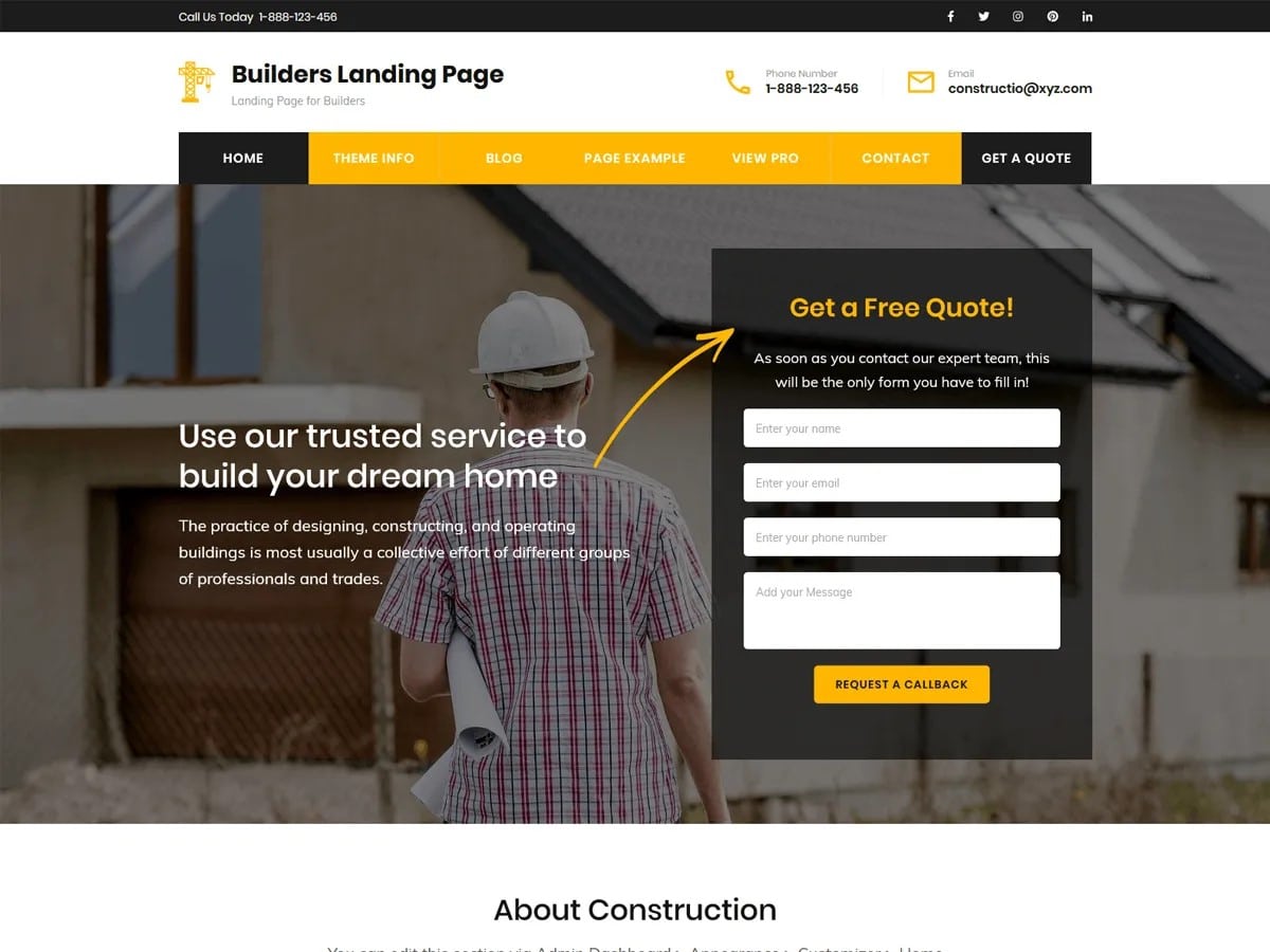
6) Use Colors to Attract Attention
Beyond being an indicator for your business, using colors within your website can direct your users. When you’re creating different elements on your website, think of what colors mean to users.

If you want your users to sign up for an email newsletter, think about how to make the button stand out: red and orange are popular options known to convert well, but it really depends on the rest of the page. As you use bright colors to attract attention to your website, make sure they contrast well with the other elements on the page.
7) Stay Consistent
Depending on the complexity of your website, you may have anywhere from 3 to 300 pages or more. As you design these pages, stick to a consistent style.
For example, don’t include a navigation bar at the top of one page and then move the navigation bar to the left side of the screen on another page. Keep your design consistent. That applies to all the little elements too. For example, don’t move your “Contact Us” button from the right side of the navbar to the left side of the navbar on different pages. A lack of consistency will make it harder for users to navigate your site.
8) Follow Current User Research
Several studies have given website designers information on how users look at websites. For example, there’s a classic Z pattern that website visitors tend to follow.
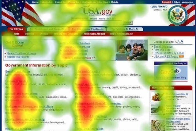
They look at the top left of the page, glance over to the right, follow diagonally down to the bottom left and then move to the right. This gives a Z pattern where users direct their eyes. Follow this to place important information and calls-to-action.
9) Follow Standard Practices
Websites tend to follow standard practices, for good reason. Typically, you see the business logo at the top left or center. Social media icons tend to stay at the bottom of the page. Calls-to-action often stay higher up on the web page, so that users see them right off the bat.
Again, when in doubt, use a WordPress consultant, or look to other big brands like Apple, Google and Microsoft, which spend big bucks researching how their users interact with their sites.
The Bottom Line
Website design can be tricky for those that aren’t professional designers. Luckily, many researchers and developers have found the best tips and tricks to improve customer satisfaction, website traffic and conversions. Here at WP Tangerine, we know the best practices to implement to provide you with the results your business needs.
As a full-service WordPress consultant, we can provide you with WordPress expert guidance, WordPress Help & WP Support, WordPress Website design services, WordPress SEO services, WordPress Programmer, and other WordPress services We also provide WordPress maintenance tips, tips in hiring WordPress developer and much more. Any WordPress needs that you have, WP Tangerine can take care of them! Request a free website analysis to see how we can help.